Parachute Oil - Packaging Redesign
Parachute Oil - Packaging Redesign
The Project
I did this packaging redesign project as a freelancer in 2017. Parachute is the brand name for various coconut-based hair care products in India that have been on the market for over three decades. It is one of the most well-known and reliable brands in the country. The product’s packaging has not changed for years. The objective of this project was to revamp the packaging and give it a more appealing appearance.
About the Brand
Unique Selling Proportion – Parachute offers 100% Pure Coconut Oil. It promises to make your hair the best in the world
Target Audience – Women of all ages in urban and rural India, as well as youthful and appearance-conscious individuals
SWOT Analysis
Strengths
- One of the most recognized and trusted brands
- It is a premium edible-grade coconut oil
- Parachute is a market leader in its category and is popular in the urban & rural markets of India
- Parachute enjoys tremendous equity and trust with every passing generation
- Parachute has excellent brand visibility through advertisements on TV, in newspapers, in magazine and online
- Brand ambassadors like leading actresses have helped the brand connect with the audience.
Weakness
- Innovations like personal massagers were available only in selected cities and in limited quantities.
- A highly competitive market means Parachute’s market share is stagnated.
Opportunities
- The brand can get into skincare by introducing oils for the entire body.
- They should launch variants that have coconut and other natural ingredients that benefit the hair. This will help them fight competition from brands with other ingredients like badam, amla, mustard etc.
- Global expansion can help them reach out to a broader audience.
Threats
- Many players entering the market can affect its business.
Design Concept
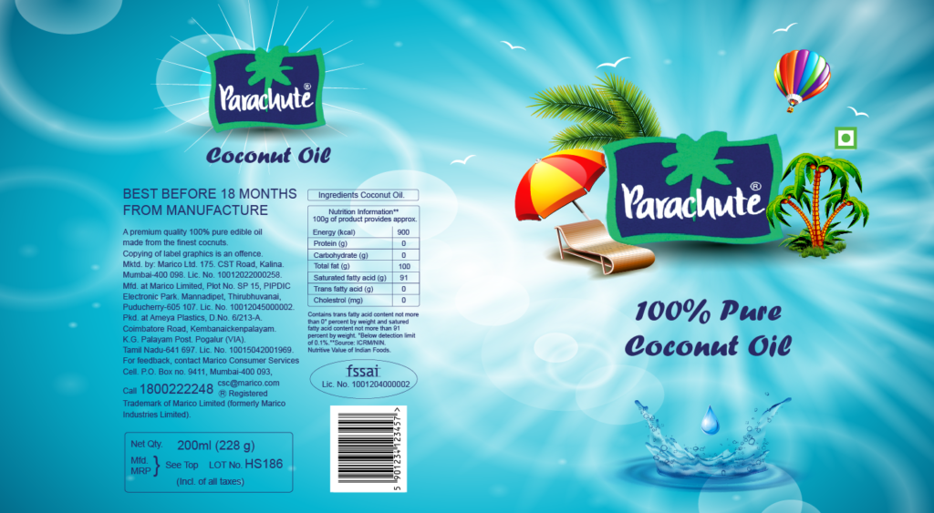
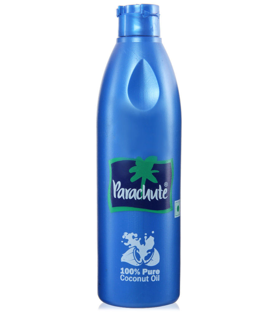
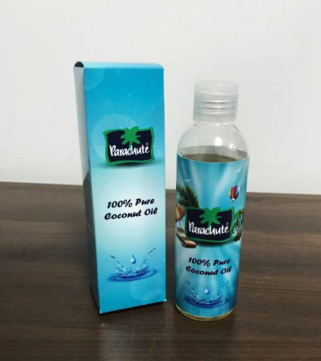
After studying the brand’s market and conducting a SWOT analysis, I created a new design. Since the blue colour of the bottle is a potent metaphor for the coconut oil, I maintained the blue colour of the bottle and rebuilt it in shades of blue to give it a more contemporary appearance. I also proposed replacing the existing bottle with a spray bottle, as it is incredibly slippery and difficult for customers to use.


